Downtimes
Comprehensive View of Machine Downtimes
Overview
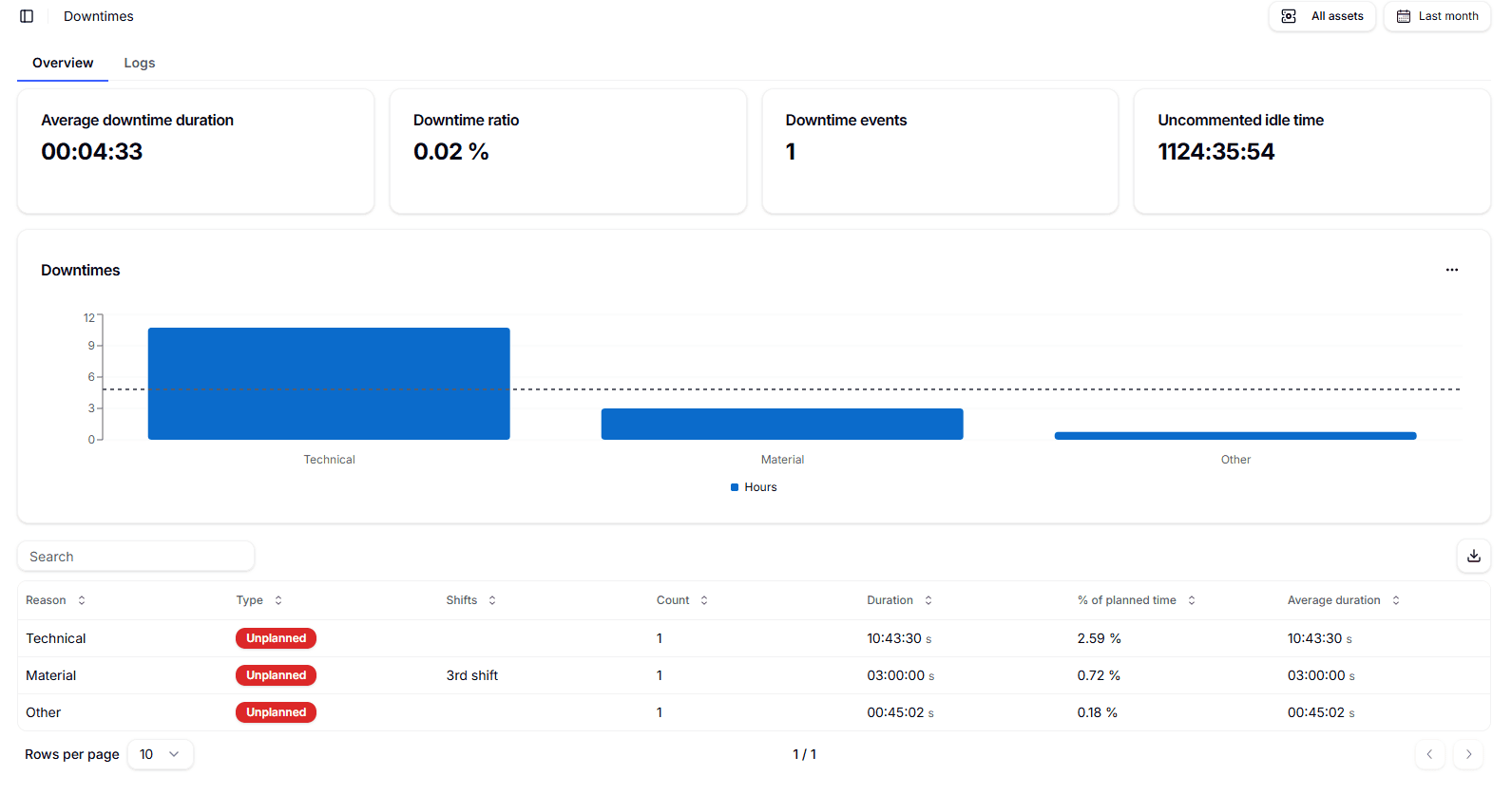
This section gives you a complete view of machine downtimes for the selected period, with summary KPIs, a cause-by-cause chart, and a detailed table. It’s designed to surface the biggest losses, understand when and why they happen, and measure the impact on planned time.

How causes are recorded. Downtime causes are causalized through the Smart Operator Interface, manually by an operator at the machine. When a period is shown as Uncommented idle time, it means idle minutes that have not yet been assigned a cause; operators can complete this causalization from the Smart Operator Interface to keep KPIs accurate.
At the top-right, choose the time range you want to analyze and select either a single asset or All assets for an aggregate view. Use the tabs to switch between Overview (high-level summary) and Logs (event-by-event list with timestamps, machine, and operator notes).
Summary KPIs (top cards)
- Average downtime duration — The average length of each downtime event in the selected period.
- Downtime ratio — The share of downtime over planned time for the same period (percentage, useful for benchmarking lines and shifts).
- Downtime events — The total number of downtime events captured.
- Uncommented idle time — Total time in Idle without an assigned cause; prioritize reconciling this to avoid blind spots in analysis.
“Downtimes” chart
Bars aggregate total Hours of downtime by Reason (e.g., Technical, Material) across the selected period and scope. Use it to quickly compare which causes contribute most to total loss. The dotted reference line is a visual guide; its exact meaning may vary by view configuration.
Detail table (downtimes by cause)
Each row represents a cause within the current filters. Columns include:
- Reason — The downtime category (e.g., Technical, Material).
- Type — Planned or Unplanned.
- Shifts — The shift most associated with the events for that cause.
- Count — Number of events for the cause.
- Duration — Sum of all event durations for the cause (hh:mm).
- % of planned time — The cause’s Duration as a percentage of planned time for the period.
- Average duration — Mean event length for the cause (Duration ÷ Count).
Actions on the table. Use the Search field to quickly filter rows by text (e.g., cause name or shift). Adjust Rows per page to change pagination. Click the Export icon to download the table for external analysis and reporting.
Good usage tips
- Use Downtime ratio to compare performance “apples to apples” across lines or periods.
- Keep Uncommented idle time near zero by completing causalization through the Smart Operator Interface.
- Combine Count, Average duration, and % of planned time to distinguish many short micro-stops from few long stops and choose the right corrective action.
- Switch to Logs when you need to investigate specific events (start/end times, machine, operator notes) for root-cause analysis.

In the Logs tab, you can view the complete history of declared downtime events—including timestamp, reason, affected asset, shift, and event duration—and you can export the dataset to Excel.
